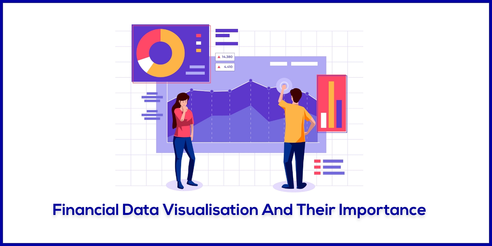
Data is king in the fast-paced financial industry. In order to make decisions that have a substantial impact on the success of their organisations, decision-makers rely on accurate and timely financial data. However, it might be difficult to handle the sheer amount and complexity of financial data. Introducing financial data visualisation, a potent tool that turns unadorned numerical data into fascinating visual representations. We will discuss the idea of financial data visualisation, along with its significance, advantages, best practices, and several widely used technologies in the field, in this blog.
Understanding Financial Data Visualisation
The practice of graphically representing complicated financial information, such as numerical data, trends, and patterns, is known as financial data visualisation. Charts, graphs, infographics, dashboards, and interactive presentations are just a few examples of these visualisations' many possible forms. Visual data presentation makes data more approachable and clear, allowing stakeholders to quickly grasp key insights.
Financial visualisations may include a range of topics, including budgeting, forecasting, portfolio management, risk analysis, and performance evaluation. They may also include income and spending analysis. The objective is to provide this data in a way that encourages rapid and precise decision-making.
Techniques for displaying financial data can be broadly divided into two categories: exploratory and explanatory. To find patterns, trends, and outliers in the data, exploratory visualisations are employed throughout the data analysis stage. On the other hand, explanatory visualisations are made to concisely and clearly convey the findings and insights to stakeholders.
Financial analysts can develop new hypotheses and learn new things by using exploratory visualisations to analyse the data more deeply. Commonly used exploratory visualisations include scatter plots, line charts, and heatmaps. On the other hand, explanatory visualisations are frequently more sophisticated and audience-specific. They could be interactive dashboards, infographics, or summary charts that offer a high-level overview of financial performance and trends.
Importance of Financial Data Visualisation
A higher level of comprehension
Humans are naturally visual creatures, and we process visual information more quickly than text-based information. Data visualisation is essential when discussing finance because the subject's data might be extremely complex. Financial experts can make complex financial concepts and data easier to grasp for stakeholders by presenting financial information in graphical styles like line charts, bar graphs, or pie charts.
A well-designed visual representation can help you understand the relevance of the data much more quickly than a convoluted spreadsheet full of numbers. Decision-makers may quickly spot critical insights with the use of visualisations, which reduces the time and effort required to analyse raw data.
Support for Decisions
In the financial industry, timely and accurate decision-making is crucial. Financial analysts and managers may quickly discover opportunities, notice trends, and assess risks thanks to visualisations. For instance, a line chart that shows sales success over time may highlight seasonal patterns, which aids sales managers in modifying their plans. Professionals can use financial data visualisation to make well-informed decisions that are in line with the objectives and plans of their company.
Insights into the possible effects of various scenarios and options can also be gained through visualisations. Decision-makers can make more informed and confident decisions when data is presented to them in a variety of visual formats that help them better grasp the potential effects of their decisions.
Interaction with Stakeholders
Communication with stakeholders, including investors, executives, and clients, is facilitated by the visual presentation of financial information. It's possible that traditional text-based reports don't communicate complex financial data as well or with as much engagement. On the other hand, visualisations foster constructive talks and foster a shared understanding. They improve communication clarity, which fosters a sense of trust among stakeholders and stronger bonds.
Data visualisation can improve the approachability and digestibility of financial data when it is presented to stakeholders. For instance, complex financial metrics can be reduced to a clear visual narrative using infographics. Stakeholders get immediate access to the data through dashboards, allowing them to explore various elements and find insights pertinent to their interests.
Patterns and Trends to Look for
The ability to assist analysts in spotting patterns and trends that may be difficult to spot in raw data is one of the key benefits of financial data visualisation. You can gain insights into stock market trends, such as price moves, highs, lows, and volume, by visualising past stock prices as a candlestick chart, for instance.
Financial experts can get insightful knowledge into the variables affecting the performance of their organisation by recognising patterns. Strategic planning, operational changes, and the identification of untapped company prospects can all be brought about as a result of these insights.
Benefits of Financial Data Visualisation
Increased Effectiveness
Financial professionals can concentrate on strategic goals by spending less time on data processing and more time swiftly identifying critical insights thanks to visual representations. They can receive real-time information on crucial financial parameters with the use of interactive dashboards, enabling them to react quickly to shifting market conditions and company requirements.
For example, a financial analyst in charge of keeping track of daily sales data can utilise a dynamic dashboard to analyse performance in real time, dig down into certain regions or product categories, and spot areas that need immediate attention. In the hectic and cutthroat financial environment, this level of efficiency may be essential.
Data accuracy
Poor analysis and decision-making based on inaccurate data can have serious financial repercussions. Data input errors or discrepancies can be found via financial data visualisation. When data is presented visually, analysts can quickly identify outliers or unexpected figures, leading them to look into and correct any inconsistencies.
Additionally, visualisations may be used to cross-reference and authenticate information from various sources, ensuring that financial reports and insights are founded on accurate data.
Real-time observation
The capacity to monitor data in real time is one of the most important benefits of interactive financial data visualisation. Users of interactive dashboards can monitor financial parameters, such as sales, expenses, or portfolio performance, as they change in real-time.
An interactive dashboard, for example, can be used by a financial manager in charge of supervising a portfolio of investments to track the success of the portfolio throughout the trading day. Any rapid changes in asset valuations or market circumstances can be seen right away, enabling the manager to act quickly to rebalance the portfolio, for example.
Greater Collaboration
By offering a common forum for discussing results and formulating solutions, financial data visualisation fosters teamwork amongst teams. Teams can interact with visualisations, exploring various scenarios and conducting data analysis collaboratively, as opposed to relying just on static reports and presentations.
In a collaborative atmosphere, stakeholders can cooperate to evaluate the data, pose queries, and derive more insightful conclusions. This encourages a culture of data-driven decision-making where the opinions of various team members are taken into account, resulting in more well-rounded and knowledgeable decisions.
Best Practice for Financial Data Visualisation
Understand Your Market
Understanding the intended audience for financial data visualisation is crucial for its success. The knowledge and information requirements of various stakeholders may differ. Analysts may prefer detailed and interactive charts, while executives and senior managers may need high-level summaries and key performance indicators.
Financial experts must customize their visualisations to match the individual demands of each audience in order to ensure effective communication. Take into account each stakeholder group's potential level of technical knowledge, familiarity with financial terms, and unique queries.
To the point and concise
Financial data visualization's main goal is to simplify complex data so that it may be understood at a look. Keep your message focused by avoiding extraneous and cluttered elements. By concentrating on the most important information and ideas, visualises can be made simpler.
Think about the "data-ink ratio," a term coined by data visualisation expert Edward Tufte, which describes the ratio of ink used to represent actual data to ancillary features. The visualization's clarity is increased by minimising extraneous components.
Formatting should be uniform:
To produce a unified and polished appearance, maintain consistency in the colours, fonts, and scales used in various visualisations. The visual appeal of the data is improved by consistent formatting, which also makes sure that stakeholders can easily understand it.
Visualising financial data can benefit from the use of colour. To attract attention to patterns, emphasise key data points, or distinguish between several categories, use colour in a deliberate manner. But be careful not to overdo it or use colours carelessly, as this could cause misunderstanding and make it harder to understand.
Investigative Interactivity
Provide interactive tools that let consumers explore data independently and dive down into particular details for complex data sets. Data can be interacted with by stakeholders through interactive dashboards and infographics, leading to greater understanding and the discovery of useful information.
More individualised and pertinent insights may result from letting people filter and manipulate data in real time. To give customers a personalised perspective of the data depending on their preferences, an interactive dashboard can, for instance, let users focus on particular time periods, product categories, or geographical areas.
Conclusion
Financial professionals can use the effective communication, data-driven decision-making, and organisational growth-promoting tools provided by financial data visualisation. Financial data visualisation simplifies and clarifies the complex world of finance by converting complex data into interactive and visual formats. For organisations looking to succeed in the data-driven market of today, adopting this strategy will surely be advantageous.